369 had an idea, a name and a logo.
The idea is great - The name is fantastic and has a deep meaning to the founder.
But 369 did not have a brand (yet).
When the logo was originally designed, it was done without any research into the company, the market or what message we as a brand wanted to communicate.
We ended up getting a logo with an overwhelming amount of colour (to stand out) but no real meaning.
Without the proper research and understanding of our business, the logo had no soul.
If all it took to stand out was a bright, multi-colour, bold logo, our job would be easy. But there's so much more involved than that. - Bonita. this!brand
We quickly found that the logo and the colours didn't align with our vision.
We felt that the logo was created in haste by someone who was not committed or invested in our success or didn't understand our core values of honesty, integrity and best practice.
We also struggled to build a consistent visual identity as the logo was not designed to be used in different applications, most tasks like social media posts or printed adverts started becoming serious issues.
We started working with this!brand. Before developing a new logo, we looked deeper into the 369 Collective, not just the business, but the entity, we looked into the brand soul.
Venessa followed this!brand's re-brand workbook and uncovered some valuable information, that they would later use to develop 369’s new identity.
Here are some of the findings:
Perception:
369˚ wanted to be perceived as Honest, having integrity, following best practices, a genuine interest in their audiences success, support
and empowerment.
Every brand holds a basic set of beliefs that influence everything they do. We call these beliefs your Brand Soul.
Knowing what these core principles are and why they matter is crucial, as they are a potent force that can actively support or sabotage your
business.
The Brand Soul is comprised of four elements:
Purpose: Why do we exist?
The primary reason 369˚ Collective was founded and exists is to provide quality products and services through a collective of trusted
service provider’s I trust with my own brand. These Entrepreneurs understand small businesses, provide an agency quality standard of work
without the agency price tag. Over the years I have unfortunately heard too many stories from small business owners where what was promised
was not delivered, wasting not only their limited budget but also their time and stalling or negatively impacting the growth and potential
of their business, often leading to losing faith in the business due to no fault of their own. I am on a mission to put a stop to this and
help small business owners spend money in only the right places for their particular business, with the best possible outcome and ROI.
Leading by example, following best practices, I project manage the entire process for my clients, ensuring promises are fulfilled and the
outcome is better than they could have imagined with ongoing support and the best possible return on investment.
Vision: What future do we want to help create? What does the future look like?
369˚ Collective is the go-to trusted service provider for small New Zealand owned businesses and then expanding worldwide to build a
369˚ model in each Country and or major centre's that provides employment to small businesses and entrepreneurs sustainably for the long
term while not treating the small business and owner as just a number like big corporate agencies and businesses do, with the peace of
mind that everything delivered will meet or exceed expectations and that customer service and ongoing local support is of paramount
importance to all the members of the collective. Ongoing support will always be New Zealand based.
Mission: What are we here to do? How do we create
that future?
To teach, inspire, motivate and empower Entrepreneur-small business owners to launch, grow or scale their businesses in a sustainable
way.
Values:
What principles guide our behaviour?
Audience
Our audience is small businesses in most cases women in business who are motivated to grow their business - This can be just a desire to
be self-employed, to an idea that needs nurturing, a recently launched business that is struggling, an established business that needs to
grow or scale.
Differentiate
By not trying to sell services and products businesses don't need and being honest with them about what they currently have in place and
how to improve it with a genuine interest in providing a solid ROI.
GOALS - To help and take care of others.
STRATEGY
- Doing
things for others, service, focus attention on other people.
BRAND VOICE - Considerate,
thoughtful, kind and generous.
CUSTOMERS FEEL - Loved, taken care of,
safe, “I am not alone in this”, secure.
MINDSET - Volunteer. Help
others. Share the causes that you are passionate about.
The Caregiver brand archetype can be summed up in two words: compassionate and self-sacrificing. The Caregiver archetype is a
personality fit for brands that aim to nurture or serve others.
The Caregiver derives meaning from helping others. This brand archetype is moved by compassion and generosity and strives to make people feel nurtured and secure.
GOALS - To relate, belong, to be accepted and to accept others.
STRATEGY - Develop
solid values, be down to earth, accessible, hard-working and nice.
BRAND VOICE - Friendly,
humble, honest, practical.
CUSTOMERS FEEL - Understood, included, warm, part
of the group.
MINDSET - Create real connections and friendships with your
audience. Share normal parts of your life with them.
It seems one of the highest compliments bestowed upon a celebrity is that the superstar “is so down to earth!” The comfort and
appeal of knowing that something or someone larger than life is actually “just one of us” is the pull of the Everyman archetype, and brands
who are relatable in this way will go a long way in capturing the hearts of their consumers.
As modelled by the Regular Joe or the Girl Next Door, the Everyman archetype is wholesome and genuine. The Everyman tends to demonstrate the underlying ideals of hard work and honesty and embraces common-sense values and authenticity. The Everyman feels no need for pretence.
The Everyman brand archetype is easily seen in mom-and-pop stores, local diners, and community events that have a down-home culture, genuine and caring.
Colours are more than just a visual aid because colours convey emotions, feelings and experiences. Colour Psychology showed that colour can affect human behaviour, influence human perception and enhance effectiveness.
Turquoise means open communication and clarity of thought.
The colour turquoise helps to open the lines of communication between the heart and the spoken word. It presents as a friendly and happy colour enjoying life.
Turquoise and cyan promote and encourage peaceful behaviours and calmness. They also encourage clear/rational thinking, thoughtfulness, cleanliness, hygiene, emotional control or repression of emotions.
A combination of blue and a small amount of yellow, it fits in on the colour scale between green and blue. It radiates the peace, calm and tranquillity of blue and the balance and growth of green with the uplifting energy of yellow.
The colour blue represents both the sky and the sea and is associated with open spaces, freedom, intuition, imagination, inspiration, and sensitivity. Blue also represents meanings of depth, trust, loyalty, sincerity, wisdom, confidence, stability, and intelligence.
Blue is calming and also represents honesty and loyalty (hence its popularity
in so many corporate branding colour schemes).
Pink is intuitive and insightful, showing tenderness and kindness with its empathy and sensitivity.
In colour psychology, pink is a sign of hope. It is a positive colour inspiring warm and comforting feelings, a sense that everything will be okay.
It is calming and non-threatening.
Physiologically, it calms and reassures our emotional energies, alleviating feelings of anger, aggression, resentment, abandonment and neglect.
This is a colour usually used in businesses relating to the female market such as cosmetics, fashion, beauty and romance. Combining it with darker colours gives it more sophistication and strength.
The colour magenta is one of universal harmony and emotional balance. It is spiritual yet practical, encouraging common sense and a balanced outlook on life.
It promotes compassion, support and kindness and encourages a sense of self-respect and contentment in those who use it. It can assist ambitions and desires to become reality.
369 Collective now has a strong starting point.
We have identified who the 369 Collective is as an identity. We can now communicate with consistent messaging and be guided by the values
of the 369 brand.
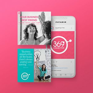
Our entire visual identity (Logo, Website, Social Media) is now a cohesive part of the whole with consistent appearance and messaging. No
more guessing.
.png)
Explore key strategies for successful lead generation in 2025, including AI-driven automation, personalized marketing, data-driven insights, and multichannel approaches to attract, nurture, and convert high-quality leads efficiently.
.jpg)
Marketing automation streamlines processes, saves time, and drives personalized engagement for small businesses. In 2025, it’s a must-have tool to boost growth, optimize campaigns, and enhance customer experiences.
In 2021, I faced one of the darkest periods of my life.
A cascade of challenges—losing two homes, a traumatic physical assault, and experiencing severe burnout—left me emotionally, mentally, and
physically depleted.
As someone who had always relied on structure, discipline, and good habits to navigate life’s uncertainties, I believed these tools would
anchor me through the chaos.
Type your paragraph here.